Best nonprofit websites, torn down.
Ten nonprofit websites, examined the way we'd examine a client's site: navigation, storytelling, conversion design, mobile thinking, and accessibility — with one concrete thing we'd borrow and one thing we'd improve for each.
A note on independence
None of the organizations featured below are CauseHouse clients. This is independent editorial analysis, not sponsored content, and nothing here implies endorsement, partnership, or a client relationship. Screenshots were captured directly by CauseHouse at a standard desktop viewport and are used only as contextual examples for this analysis.
Ten sites, evaluated on the same seven criteria.
We chose organizations across different missions and budgets — legal advocacy, environmental restoration, arts, human rights, direct service, and organizing — specifically to avoid a list that's secretly just "well-funded orgs with big agency budgets." Each gets the same lens: why it stands out, how it's organized, how it tells its story, how it asks for action, how it likely handles mobile, and what we can responsibly observe about accessibility and usability without running a full audit.
Innocence Project
Why we chose it
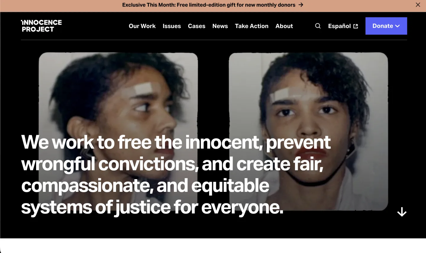
The hero uses real case photography — not stock imagery — as direct evidence of the organization's work, paired with a mission statement stated in plain, declarative language instead of vague nonprofit-speak.
Navigation / information architecture
A compact top nav (Our Work, Issues, Cases, News, Take Action, About) keeps case-driven content in front. "Take Action" sits as its own primary item rather than being buried in a menu.
Storytelling
Two mugshot-style photographs of the same person, shown before context is given, create an immediate question the mission statement then answers — a more visceral opening than a written case study alone.
Conversion / action design
The donate button carries a dropdown (likely one-time/monthly options) rather than forcing a page jump, and a limited-time monthly-donor incentive sits in the top promo bar — a real urgency lever, used once, not stacked everywhere.
Mobile / responsive thinking
The bold sans-serif wordmark and large-type mission statement are the kind of components that tend to restack cleanly on small screens, though we did not load the live site on a physical device to confirm behavior.
Accessibility / usability
Strong white-on-black contrast for the headline text. Photography this dark and desaturated is worth a dedicated contrast check for any overlaid text variants we didn't capture.
One thing we'd borrow
Using real case photography as the emotional entry point instead of a written story or stock imagery — it's a stronger, faster trust signal than most nonprofit homepages attempt.
One thing we'd improve
The promotional banner ("free limited-edition gift for new monthly donors") sits directly above a hero about wrongful convictions — worth testing whether that juxtaposition undercuts the seriousness of the opening moment.
Surf & Turf
Why we chose it
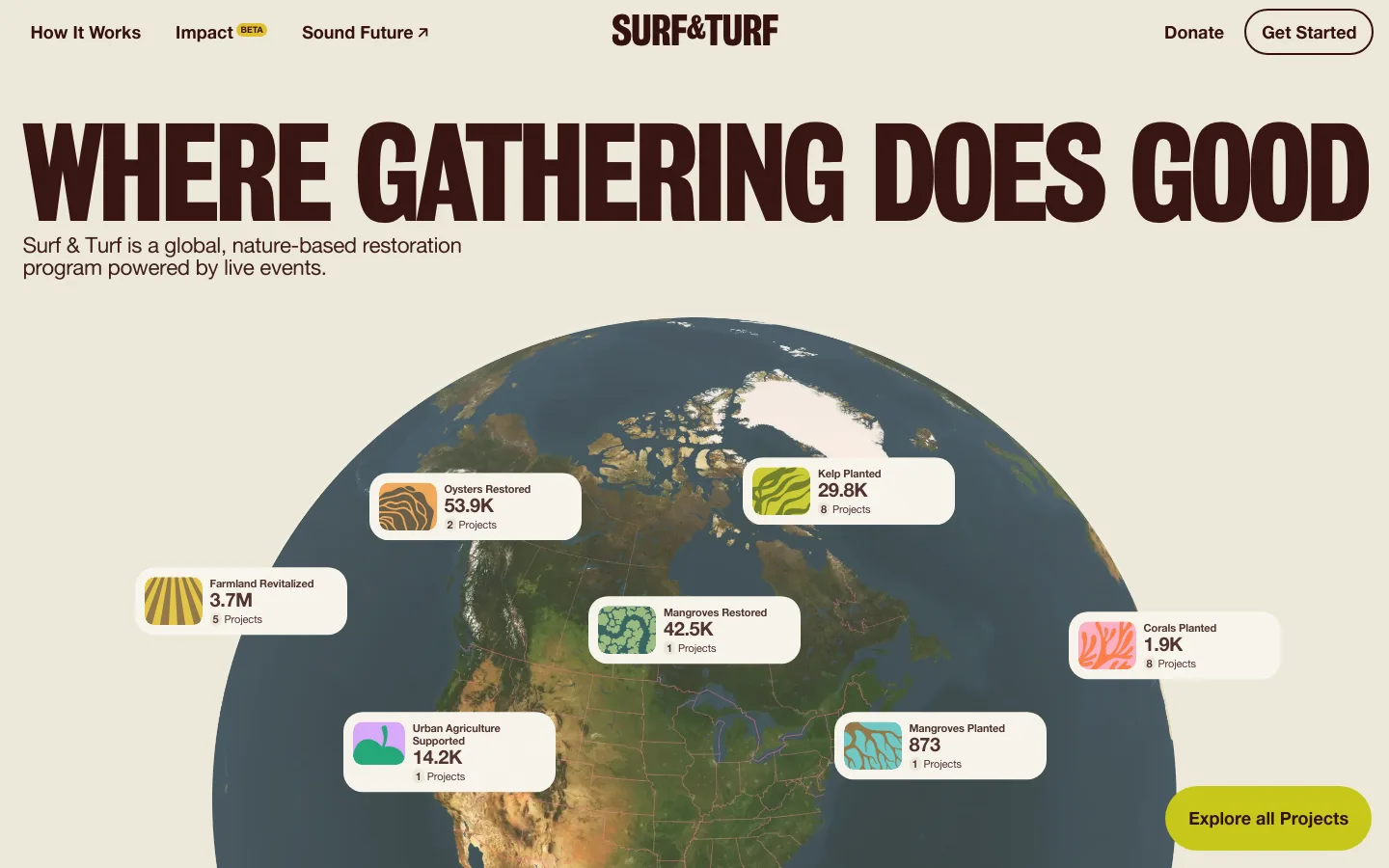
An interactive 3D globe surfacing live-feeling impact numbers (oysters restored, kelp planted, mangroves restored) is a genuinely distinctive way to make environmental impact data feel tangible instead of abstract.
Navigation / information architecture
Minimal by design — How It Works, Impact, Sound Future, Donate — which fits an organization built around one clear program concept rather than a sprawling set of initiatives.
Storytelling
"Where gathering does good" reframes the org's actual mechanism (live events funding restoration) in one line, then the globe visualization proves it with specific, located numbers.
Conversion / action design
"Get Started" as the primary header CTA (not "Donate") reflects that this org's core action is participation in events, not a straight one-time gift — the CTA language matches the actual donor/participant journey.
Mobile / responsive thinking
An interactive globe is a genuinely hard component to make work well on mobile; how it degrades (a static map? a list?) would be the first thing we'd test on a real device before recommending this pattern.
Accessibility / usability
The interactive globe is the highest-risk element here — data visualizations like this need a genuinely accessible alternative (a data table or list) for screen reader and keyboard users, and we can't confirm one exists without testing.
One thing we'd borrow
Turning impact reporting into an explorable visualization instead of a static stat block — it invites curiosity rather than just asserting credibility.
One thing we'd improve
Build (and clearly link to) an accessible alternative to the globe for anyone who can't use a pointer-driven 3D visualization.
The Ocean Cleanup
Why we chose it
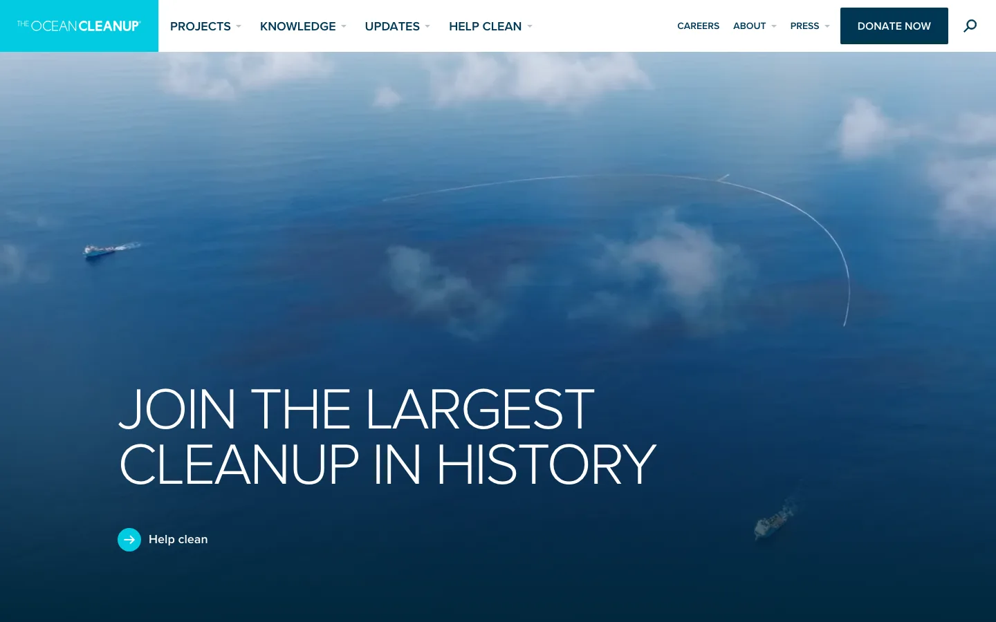
Full-bleed aerial footage of an actual cleanup system in open water is a rare case where the hero image is direct proof of the org's core claim, not stock photography standing in for it.
Navigation / information architecture
A tight top-level nav (Projects, Knowledge, Updates, Help Clean) with Careers/About/Press deliberately secondary — the information architecture makes clear what a first-time visitor is meant to explore first.
Storytelling
"Join the largest cleanup in history" is a bold, falsifiable claim stated plainly — the kind of specific, confident line that's stronger than most nonprofit taglines because it invites scrutiny rather than avoiding it.
Conversion / action design
"Help clean" as the primary CTA, paired with a separate "Donate Now" in the header, cleanly separates the participation ask from the funding ask instead of collapsing both into one generic button.
Mobile / responsive thinking
The full-bleed video/photo hero with overlaid text is a pattern that needs careful art-direction at narrow viewports to keep text legible over the image — worth checking specifically on small phones.
Accessibility / usability
White text over a photographic background is the main risk area here; contrast can vary across different regions of a photo, and we can't confirm every hero variant meets a reliable contrast ratio without testing.
One thing we'd borrow
Using real, specific documentary imagery as literal proof of impact instead of illustrative stock photography.
One thing we'd improve
Audit hero text contrast across the specific photo crops used, since photographic backgrounds are inherently inconsistent in contrast from one area to another.
New Museum
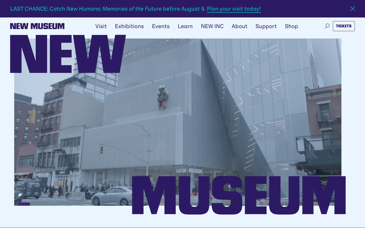
Why we chose it
Oversized, overlapping wordmark typography treated as a design element (not just a logo) signals "we are a design-forward cultural institution" before a visitor reads a single word of copy.
Navigation / information architecture
A dense but organized top nav (Visit, Exhibitions, Events, Learn, NEW INC, About, Support, Shop) reflects a real multi-program institution — a museum, an incubator, a retail arm — without feeling cluttered.
Storytelling
The building's own architecture, shown as the hero image with the museum's name typographically wrapped around it, tells visitors this is a physical, visitable place before any programming copy does.
Conversion / action design
"Tickets" is the sole high-contrast button in the header — a museum's real primary conversion is a visit, not a donation, and the design reflects that honestly.
Mobile / responsive thinking
Oversized display typography that overlaps a photo is a layout that needs deliberate mobile-specific treatment; at narrow widths this kind of overlap often needs to simplify rather than just scale down.
Accessibility / usability
The exhibition promo bar includes a visible close control, which is a good sign for user control over persistent UI — though large stylized display type can sometimes reduce legibility, worth a dedicated check.
One thing we'd borrow
Treating brand typography as an actual design element on the homepage, not just a small logo in the corner.
One thing we'd improve
Confirm the overlapping title treatment has a genuinely simplified mobile version rather than a cramped scaled-down copy of the desktop layout.
Rainforest Trust
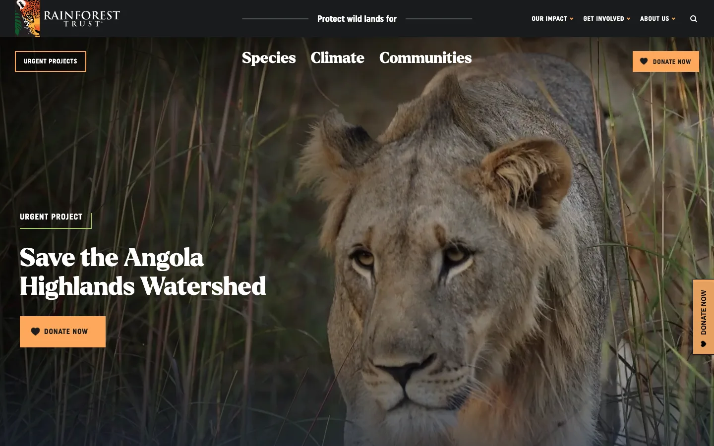
Why we chose it
Folding the site's three impact categories (Species, Climate, Communities) directly into the hero headline — "Protect wild lands for [category]" — is an efficient way to communicate scope without a separate explainer section.
Navigation / information architecture
A sticky vertical "Donate Now" tab plus a repeated header donate button plus an inline donate button on the featured project is a lot of donate surface area — effective, but worth watching for diminishing returns.
Storytelling
"Urgent Project: Save the Angola Highlands Watershed" borrows real news-editorial framing (urgency, specificity, a named place) instead of generic "help us protect nature" language.
Conversion / action design
Three donation entry points above the fold is aggressive but coherent, because every instance ties to the same specific, urgent project rather than three different generic asks.
Mobile / responsive thinking
A full-bleed wildlife photo with a sticky side donate tab is a pattern that needs rework on mobile, where a fixed side tab typically has to migrate to a bottom bar or disappear entirely.
Accessibility / usability
White text over a wildlife photo again raises the same photographic-contrast question as other image-heavy heroes here — the specific crop shown tests reasonably legible, but that will vary by photo.
One thing we'd borrow
Using one specific, named, urgent project as the entire homepage narrative instead of a general appeal — it's concrete in a way most donation asks aren't.
One thing we'd improve
Three separate donate CTAs above the fold is worth A/B testing against a single, more prominent one — more choices can sometimes reduce conversion rather than improve it.
Human Rights Watch
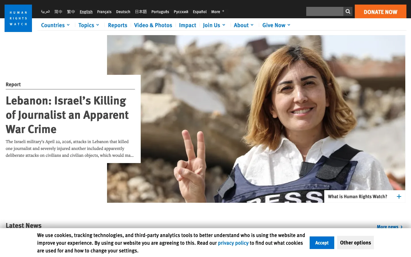
Why we chose it
It's structured like a wire news service, not a nonprofit homepage — a dated "Report" card with a real headline is the first thing a visitor sees, which fits an organization whose core product is credible reporting.
Navigation / information architecture
Ten-plus language options in the header signal genuine global reach, and a real search bar (not just an icon) reflects how people actually use this site — as a reference archive, not a one-time landing page.
Storytelling
Leading with a specific, dated report headline ("Lebanon: Israel's Killing of Journalist an Apparent War Crime") rather than an evergreen mission statement treats the homepage as a living publication.
Conversion / action design
"Donate Now" in high-contrast orange is the only strongly colored element in an otherwise restrained, journalistic palette — it stands out precisely because everything else is deliberately quiet.
Mobile / responsive thinking
A dense multi-language, multi-dropdown header is the hardest pattern here to translate to mobile well; collapsing ten-plus languages and multiple nav sections into a usable mobile menu is a real design challenge.
Accessibility / usability
A visible cookie/tracking consent banner with clear Accept and "Other options" controls is good practice — it doesn't force a binary accept-or-leave choice.
One thing we'd borrow
Treating the homepage as a living news product with dated, specific headlines instead of static evergreen messaging.
One thing we'd improve
The multi-language, multi-dropdown header is a lot of cognitive load above the fold — worth testing whether a simplified primary nav with language selection moved elsewhere improves first-visit clarity.
Midwest Food Bank
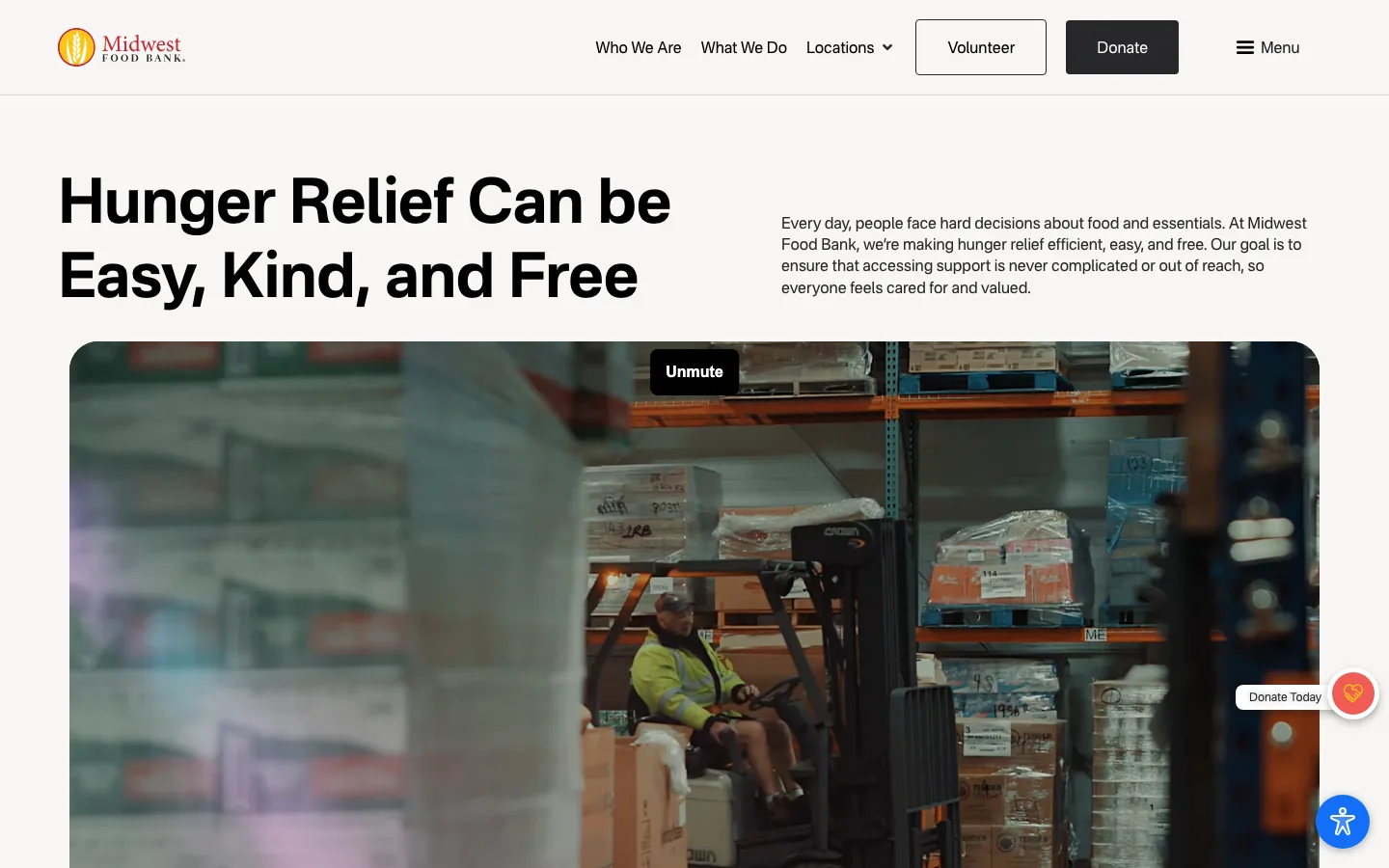
Why we chose it
"Hunger Relief Can Be Easy, Kind, and Free" is a genuinely well-crafted headline — it reframes the org's value proposition around the experience of receiving help, not just the org's own generosity.
Navigation / information architecture
"Volunteer" gets equal visual weight to "Donate" in the header — an honest signal that this organization's model depends as much on labor as on money.
Storytelling
Real warehouse video (a forklift operator moving actual pallets) grounds the mission in operational reality instead of an emotional stock photo — it shows the org actually doing logistics work, which builds a different kind of trust.
Conversion / action design
A floating heart-icon donate button stays visible without a hard sticky bar, and "Donate Today" as a secondary floating element alongside the primary header CTA gives constant access without overwhelming the page.
Mobile / responsive thinking
A full-width video hero is heavy for mobile data and battery; whether it degrades to a static poster frame on smaller or slower connections is worth confirming directly.
Accessibility / usability
Video content needs captions or a clear pause control for anyone sensitive to motion or unable to process audio-visual content simultaneously — we can verify a pause/unmute control exists, but not caption availability.
One thing we'd borrow
Writing a headline about the donor/recipient experience ("easy, kind, and free") instead of describing the organization's operations.
One thing we'd improve
Confirm the hero video has accessible controls (pause, captions if audio is present) and a reasonable fallback for slow connections.
Immigrant Defense Project
Why we chose it
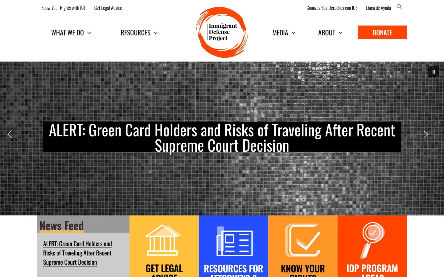
A bilingual utility bar above the primary nav ("Know Your Rights with ICE" / "Conozca Sus Derechos con ICE") puts the organization's most time-sensitive, highest-stakes content ahead of anything else on the page — including the logo.
Navigation / information architecture
A four-tile icon grid immediately below the fold (Get Legal Advice, Resources for Attorneys, Know Your Rights, IDP Program Areas) routes visitors by urgent need, not by internal org-chart categories.
Storytelling
The hero headline is a real-time legal alert ("Green Card Holders and Risks of Traveling After Recent Supreme Court Decision"), which treats the homepage as a rapid-response public service tool rather than a brand showcase.
Conversion / action design
"Donate" is present but visually secondary to "Get Legal Advice" and "Know Your Rights" — an honest hierarchy for an organization whose most urgent visitors need help, not a donation ask, in the moment.
Mobile / responsive thinking
The bilingual utility bar and the four-tile icon grid are both patterns that should stack cleanly on mobile, though the amount of header content (two nav rows plus utility links) is worth testing for mobile menu complexity.
Accessibility / usability
High-contrast color blocks (orange, blue, yellow) for the icon grid support quick visual scanning, which helps under stress — a real usability consideration for a legal-crisis-oriented site.
One thing we'd borrow
Prioritizing urgent, actionable information (know-your-rights content) above branding and donation asks — the hierarchy matches what a visitor in crisis actually needs first.
One thing we'd improve
The hero background uses a stylized grayscale mosaic treatment that reduces visual warmth at an emotionally high-stakes moment — worth testing against a more direct, human photographic treatment.
Amnesty International USA
Why we chose it
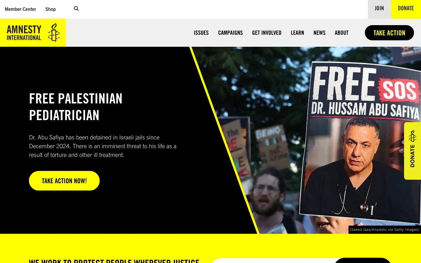
A high-contrast black-and-yellow brand system, used consistently down to the donate tab and CTA buttons, makes this one of the most immediately recognizable nonprofit visual identities on the web.
Navigation / information architecture
Diagonal yellow accent shapes break up a photojournalism hero without a heavy graphic overlay — a distinctive way to add brand texture to real campaign photography.
Storytelling
"Free Palestinian Pediatrician" as the hero headline, paired with a specific detained individual's photo, follows the same specific-person-over-abstract-mission pattern that works well across several sites on this list.
Conversion / action design
A donation modal appeared automatically on page load in our test, offering a matched-gift incentive — an aggressive but common advocacy-sector pattern; it's worth testing against a less interruptive placement to see which converts better without adding friction for first-time visitors.
Mobile / responsive thinking
Diagonal graphic shapes and overlaid text require careful breakpoint-specific art direction; how the diagonal hero treatment resizes on mobile is worth checking directly, since diagonal layouts are prone to awkward cropping at narrow widths.
Accessibility / usability
The immediate donation modal includes a visible close control, which is good — but auto-triggered modals on load can be disorienting for screen reader users if focus isn't managed carefully, which we can't confirm without direct testing.
One thing we'd borrow
A disciplined two-color brand system applied consistently across every UI element, not just the logo — it reads as intentional rather than decorative.
One thing we'd improve
Reconsider triggering the donation modal automatically on page load; a scroll-triggered or exit-intent version would likely reduce first-impression friction for new visitors.
United We Dream
Why we chose it
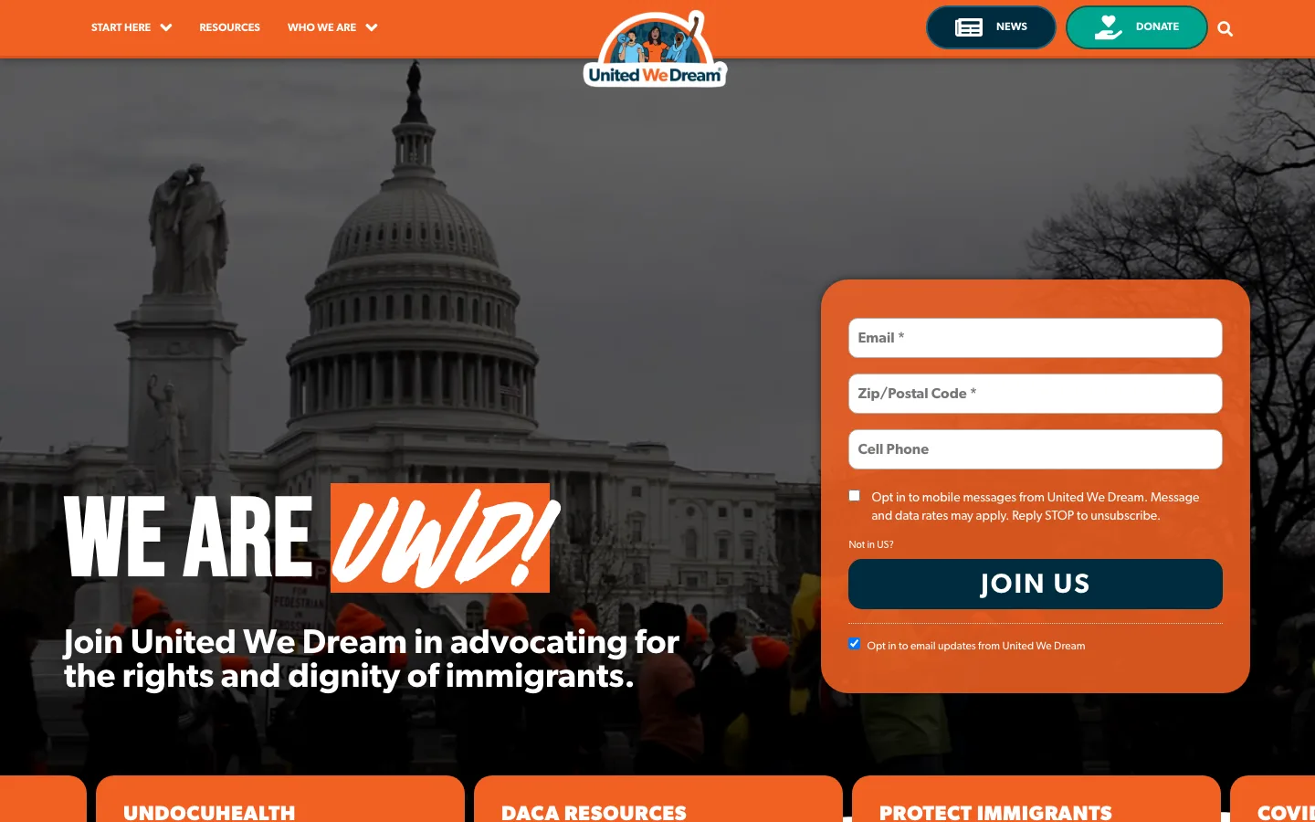
Embedding the signup form (email, zip code, cell phone) directly in the hero, rather than linking out to a separate landing page, removes a full click-through step from the highest-intent action on the page.
Navigation / information architecture
"News" and "Donate" both get pill-shaped header treatment alongside a compact dropdown-based primary nav (Start Here, Resources, Who We Are) — a small footprint for an organization with a lot of program areas.
Storytelling
Real documentary photography from an actual Capitol protest, rendered in monochrome with the brand's orange as the only color accent, ties the visual identity directly to real organizing work instead of stock activism imagery.
Conversion / action design
Program tiles (UndocuHealth, DACA Resources, Protect Immigrants) sit immediately below the fold, letting visitors self-select into the specific support track relevant to them rather than reading generic program copy first.
Mobile / responsive thinking
An embedded multi-field form directly in the hero is a heavier mobile UX than a single email-capture field — worth checking whether the field count reduces on smaller screens to lower the completion barrier.
Accessibility / usability
Two pre-checked checkboxes (mobile opt-in and email opt-in) sit right above the form's submit button — pre-checked consent boxes are worth reviewing against current consent-UX best practice, separate from accessibility narrowly defined.
One thing we'd borrow
Embedding the primary conversion form directly in the hero instead of behind a second click — it shortens the highest-intent path on the page.
One thing we'd improve
Reconsider pre-checked opt-in boxes on the signup form; requiring an active choice is generally considered better practice for informed consent.
Synthesis
What the best nonprofit websites actually have in common.
Across ten very different missions and budgets, the same handful of patterns kept showing up — and the same handful of risks kept concentrating in the same components.

Immediate mission clarity
Every strong homepage here communicates what the organization does within the first screen — often through a specific headline or image, rarely through an explainer paragraph.
One person or one place, not an abstraction
The Innocence Project, Amnesty, and Rainforest Trust all lead with a specific named person, detainee, or place instead of a general mission statement. Specificity consistently reads as more credible than abstraction.
Visible action pathways, honestly prioritized
The strongest sites match their primary CTA to their actual operating model — "Get Legal Advice" before "Donate" for a legal crisis org, "Volunteer" weighted equally to "Donate" for a food bank.
Restraint in donate-ask density
More donate buttons is not automatically better. The sites using donate CTAs most sparingly and deliberately (tied to a specific project or moment) read as more trustworthy than the ones repeating a generic ask everywhere.
Real documentary imagery over stock photography
The Ocean Cleanup, United We Dream, and Midwest Food Bank all use real operational or documentary photography and video instead of illustrative stock imagery — it functions as evidence, not decoration.
Mobile and accessibility risk concentrates in the same places
Interactive visualizations, diagonal or overlapping graphic treatments, and auto-triggered modals were the recurring components most likely to need dedicated mobile and accessibility testing — worth flagging early in any similar build, not discovered at launch.
See how these patterns apply to your site.
How CauseHouse approaches strategy-led, conversion-focused builds.
Explore →Redesign guideChecklist, budgets, timeline, and SEO-safe migration.
Explore →Website auditSee what's actually working — and not — on your current site.
Explore →Cost calculatorEstimate a realistic budget for a redesign like these.
Explore →Readiness assessmentCheck whether your organization is ready to start.
Explore →RFP GeneratorTurn inspiration into a procurement-ready RFP.
Explore →